

Data is no longer something that only data specialists need to consider. Data now drives all good business decisions.
Data visualization makes it easier to understand and interpret large amounts of text and data by transforming them into a visual form. In this article, we will look at some examples of data visualization and the steps to build them.
Data visualization process flow
It’s important to create visualizations that help the users. Also, make sure that your visuals don’t become misleading. Considering these, here are some steps that you should follow:
- Determine the decision you want to make. Formulate the decision as a question so you know the answer you seek.
- Identify the metrics that inform the decision. Once you have identified them, determine whether you can accurately collect them.
- Develop the story you want to tell. Data visualization consists of storytelling.
- Select the appropriate visual. At this step, you can focus on choosing the graph and color schema.
- Add relevant elements to the visual. Title the visual appropriately. Ensure that the units are correct and that the legend explains the meaning of color.
- Let a nonexpert review the visual. Ideally, a nonexpert should be able to comprehend the story you’re trying to communicate without any issues.
Data visualization examples
Here are some data visualization examples. You will choose one depending on what you want to communicate to your audience.
Chart: Information presented in a tabular, graphical form with data displayed along two axes. It can be in the form of a graph, diagram, or map.
Table: A set of figures displayed in rows and columns.
Graph: A diagram of points, lines, segments, curves, or areas representing certain variables in comparison, usually along two axes at a right angle.
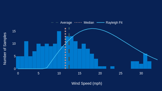
This example of a graph is a representation of a wind speed histogram.
Geospatial: A visualization that shows data in map form using different shapes and colors to show the relationship between pieces of data and specific locations.
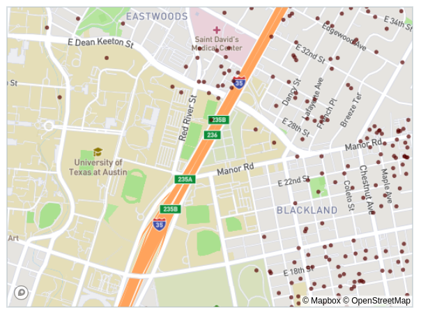
This example of Geospatial displays the map of the Airbnb listings in the city of Austin, USA.
Infographic: A combination of visuals and words that represent data. It usually uses charts or diagrams.
Dashboards: A collection of visualizations and data displayed in one place to help analyze and present data.
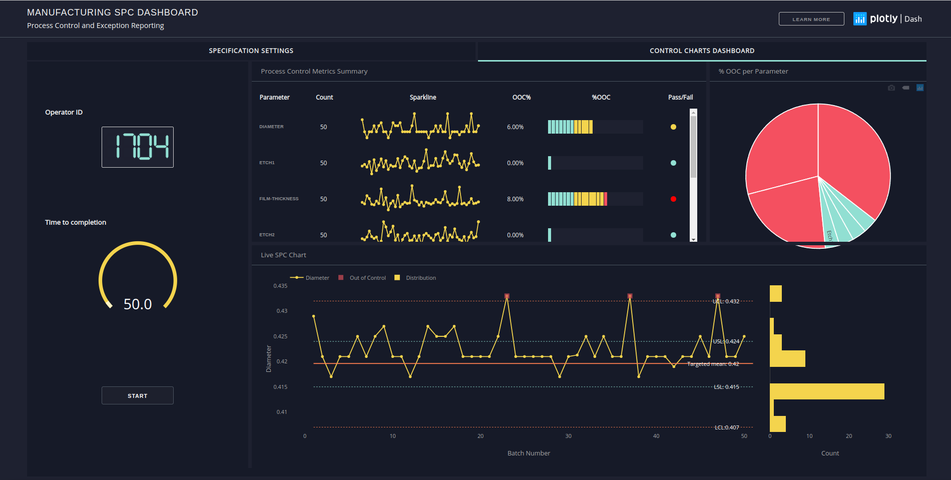
This example of a Dashboard is built on Python codes with the Plotly library. It shows the Process Control and Exception Reporting.
Tools for Data Visualization
I started exploring data visualization using Python libraries. It was an entry point to the Data Analysis gateway. Another popular programming language that offers a similar path is R.
Data visualization tools vary from no-code business intelligence tools like Power BI and Tableau to online visualization platforms like Google Charts.
When deciding on a data visualization tool, you should consider the following factors:
- Easy to learn. Simpler data visualization tools are better suited for non-technical users but have more constraints and limitations.
- Flexibility. If you want complete control over every aspect of your visualizations, choose tools with wide flexibility.
- Price. This is an important factor to consider when choosing a data visualization tool. Some tools function better than others, depending on your needs and budget.
Creating data visualizations is about more than making data easier to understand. It’s about telling a story and ensuring everyone in your team or organization has a role.
Happy data visualizing 📊
